


At Aeterna Labs, we know that the illusion of news and media cycles as disconnected lists is exactly that: an illusion. Stories overlap. Events develop into other events. A political decision becomes an economic story. A sporting event intersects with business, travel or public safety. One breaking story can suddenly pull dozens of previously separate conversations into the same orbit.
If we could see those relationships: what would they look like?
At Aeterna Labs, we have been experimenting with a way of visualising the media landscape: an interactive topic map that represents current news stories according to their contextual relationship to one another.
The result looks less like a news feed and more like a living constellation.
Explore the maps:
English: https://aeternalabs.ai/media/plots/3dplot_topic_en.html
Swedish: https://aeternalabs.ai/media/plots/3dplot_topic_sv.html
Headlines → Context
Articles covering similar subjects tend to occupy similar contextual territory. Instead of treating every article as an isolated piece of content, topic modelling allows us to examine the complex underlying semantic relationships between them.
When these relationships are projected into a three-dimensional space, patterns start to become visible.
Stories discussing closely related events or themes gather together. Larger conversations form recognisable clusters. Other stories sit between groups, reflecting the fact that the boundaries between subjects are rarely as neat as a traditional taxonomy might suggest.
Move around the map and you are effectively navigating the structure of the current media conversation.
A conventional news category might tell us that an article belongs to "Sport", "Business" or "Politics". A contextual map can begin to show something different: what a story is close to, what conversations surround it, and how apparently separate subjects relate to one another.
The news cycle has a shape
One of the most interesting things about mapping news this way is that it makes the unevenness of media attention immediately visible.
The news cycle is not a collection of equally important topics.
At any particular moment, a relatively small number of events can generate large ecosystems of coverage. Around them sit smaller clusters: developing stories, specialist subjects and conversations that may be locally significant without dominating the wider media environment.
That creates a landscape of dense centres, smaller islands and the spaces connecting them.
And those spaces can be just as interesting as the clusters themselves.
Consider how a major event can simultaneously generate reporting about economics, politics, security, transport, entertainment and public reaction. Categorising each article individually can separate those stories. Looking at their contextual relationships can reveal that they are actually part of the same wider information environment.
In other words, the map makes something visible that readers intuitively understand: topics do not exist in isolation. Weather (mild weather reporting, not catastrophe, which often bleeds into business and politics) and Real Estate do, though, consistently live in their own space.
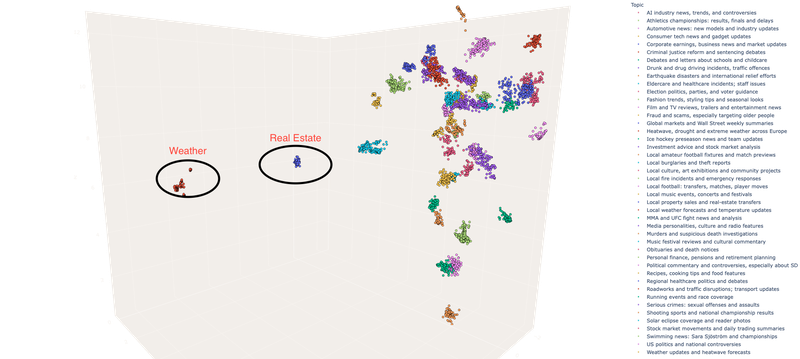
Swedish Context Cube, September 17, 2026: Aeterna Labs.
English and Swedish media are not simply translations of one another
This becomes particularly interesting when comparing the English and Swedish maps.
Language-specific media environments reflect different editorial priorities, institutions, audiences and cultural contexts. The same international event may occupy a prominent position in both languages while being surrounded by very different secondary conversations.
Other clusters may be highly visible in one language environment and comparatively peripheral in the other.
This is one reason why Aeterna Labs approaches contextual analysis on a language-specific basis. Understanding Swedish media is not simply a matter of translating an English model into Swedish. Language carries its own associations, terminology, cultural references and ways of framing events.
The two maps therefore offer more than two versions of the same visualisation. They provide windows into two related but distinct information environments.
From classification to relationships
For contextual intelligence, this is an important shift.
Classification asks:
What is this content about?
Topic mapping adds another question:
What is this content related to?
That second question can reveal a great deal about how information develops.
A story may sit firmly inside a large, established cluster. Another may occupy the boundary between several conversations. A new cluster may begin to emerge as an event generates more coverage. Separate groups may move conceptually closer as previously unrelated stories become connected by a new development. Nobody thought Ed Sheeran’s world tour would have anything to do with Palestine/Israel a week ago, yet here we are.
Seen this way, context is not static. It changes with the news cycle. Worlds collide, and our data – and segments – reflect that.
This is especially important in media environments where events develop quickly. A topic that was peripheral yesterday can dominate coverage today, while a major story can fragment into multiple related conversations as journalists explore its political, economic, cultural and human consequences.
Why visualizing context matters
For publishers, researchers and advertisers, understanding these relationships can provide a different perspective on media content. They can help reveal the wider editorial environment surrounding individual stories. For researchers, topic maps offer a way to explore how narratives and events form within large streams of text.
And for contextual advertising, they illustrate why simply matching a campaign against a handful of keywords can miss much of what makes a piece of content relevant.
A word tells you that something was mentioned. Context fills in the blanks to tell you what the story is actually about. And contextual relationships tell you where that story sits within the wider conversation.
A living map of the media
The media landscape keeps changing.
New stories appear. Existing stories gather momentum. Conversations merge, split or disappear from the news cycle. The structure you see today will not necessarily be the structure you see tomorrow.
That makes the visualisation less like a static chart and more like a snapshot of a living information system. Which stories dominate the landscape? Which topics unexpectedly sit close together? Where do you find isolated clusters? And how different does the media conversation look when you move from English to Swedish?
Open the maps, move through the clusters and see what the news looks like today.
Explore the English topic map:
https://aeternalabs.ai/media/plots/3dplot_topic_en.html
Explore the Swedish topic map:
https://aeternalabs.ai/media/plots/3dplot_topic_sv.html
The news cycle will evolve, but these links will stay stable. Save them to your Bookmarks and get a weekly snapshot of the current conversation – on us!
See you at DMEXCO 2026
Have any campaigns coming up that could use our data? Want any other geos or segment-specific Context Cubes? Let’s chat at DMEXCO.